Mobile-Friendly Test
Enter a URL and the test fetches the page's HTML and runs four quick checks for mobile basics: the viewport tag, device-width scaling, CSS media queries and font sizes. You get a Mobile-Friendly or Needs Improvement verdict, a checks-passed score and a list of issues.
Updated · by the Linkstonic team
The four checks
This is a code-level test. It reads the markup Linkstonic's server fetches, and the tool's own note says plainly that it doesn't emulate a phone rendering the page.
Viewport meta tag
Passes when the page has a meta viewport tag at all, and the row shows its exact content. Without this tag, phones render the page at a desktop width (usually around 980 pixels) and shrink it down, which is the classic zoom-to-read page.
Device-width viewport
A viewport tag can exist and still be wrong, for example a fixed width=1024. This check passes when the viewport is responsive, meaning it's set to the device's width. The standard value is "width=device-width, initial-scale=1".
CSS media queries
Counts the @media rules it finds and passes when there is at least one. The row shows the number, such as "12 found". Zero usually means the layout has no breakpoints, though a page that is fluid by design can work without any.
Font size
Passes when the page doesn't declare tiny fixed pixel font sizes. Small fixed px text is the part of a desktop layout that stays unreadable on a phone even after everything else reflows, and it forces visitors to pinch and zoom to read.
Verdict and timing
The header shows Mobile-Friendly or Needs Improvement, the number of checks passed out of 4, and how long the fetch took in milliseconds. A slow time here is a rough hint only, since it measures one server-to-server request, not a phone on a mobile network.
An older site that half works
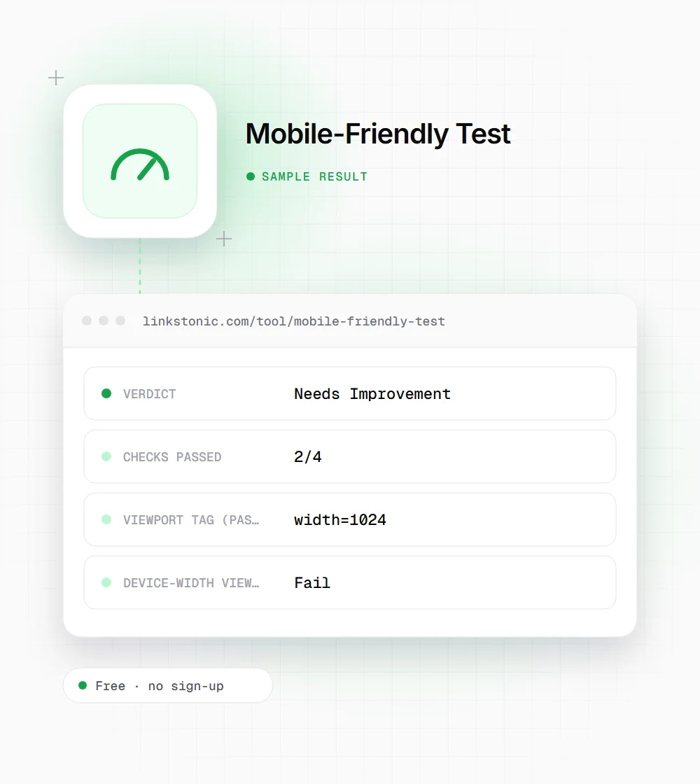
An illustrative result for a legacy page on example.com, invented to show how the checks combine. It isn't a measurement of a real site.
https://example.com/about-us.html
The page has a viewport tag, but it pins the width at 1024 pixels, so its three media queries never fire on a phone. Changing that one value to device-width is often the biggest single fix.
Where a quick markup check helps
It won't replace a real device, but it answers the basic questions in seconds.
Inherited or legacy sites
Old templates are the ones missing a viewport tag or using a fixed width. Running a handful of URLs tells you whether you're looking at a responsive site with small problems or a desktop-only site that needs a rebuild.
Landing pages from page builders
Pages built outside your main theme, in a campaign tool or a custom HTML file, often skip the viewport tag. Check them before paid traffic, most of it mobile, lands on them.
Developers after a template change
A header or layout refactor can drop the viewport tag without anyone noticing on a desktop screen. A quick test on staging and again on production confirms the mobile basics survived the deploy.
What a pass here does and doesn't mean
Google indexes the mobile version of pages, so a page that is broken on phones is broken for Google too. Google retired its own Mobile-Friendly Test and the Search Console Mobile Usability report in December 2023, and now points people to Lighthouse. Quick checks like this one fill the gap for the basics.
Four passes don't mean a page is pleasant on a phone. This test doesn't render the page, so it can't see tap targets that sit too close together, a table that overflows sideways, or a pop-up that covers the content. I'd use it to catch missing foundations, then open the page on a real phone.
For AI search the mobile layout matters less than the text. ChatGPT, Perplexity and AI Overviews read content, not breakpoints. But Google's crawler fetches the mobile version, so if your mobile template hides sections or drops content, those are the sections Google, and anything built on its index, may never see.
Fixing a failed check
Most failures take one line of code. The layout work after that is the real job.
- 01
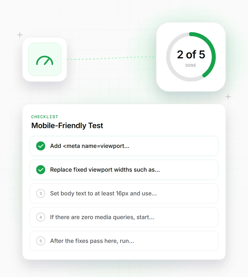
Add <meta name="viewport" content="width=device-width, initial-scale=1"> inside the head of every template, including landing pages built outside your main theme.
- 02
Replace fixed viewport widths such as width=1024 with device-width. Nothing else responsive works until this is right.
- 03
Set body text to at least 16px and use rem units, so text scales with the user's own settings.
- 04
If there are zero media queries, start with one breakpoint around 768px that stacks columns into a single column.
- 05
After the fixes pass here, run Lighthouse in Chrome DevTools and scroll the page on a real phone for tap targets and overflow.